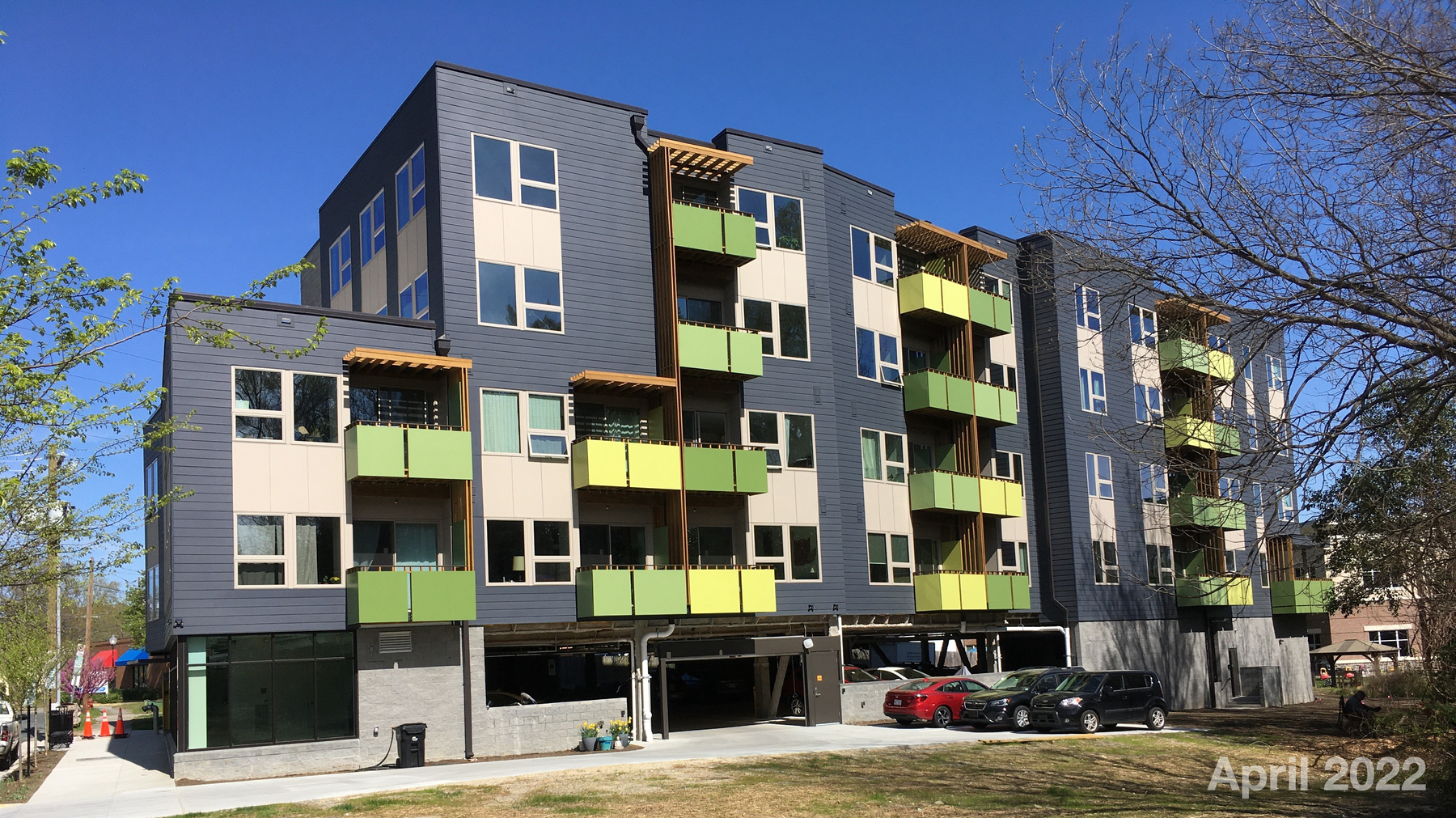
Lessons Learned on Maintaining our Cohousing Community’s Newsletter
#We got several compliments on the Dec 2022 newsletter I did for our Bull City Commons Cohousing community.
So I thought I’d put down here a few things that I do and a few lessons learned along the way. This post may be helpful to cohousing or other communities wanting to start their own newsletter.
I’ve been writing the Bull City Commons Cohousing newsletter since December 2019 or thereabouts when I took over from the former editor. You can see the newsletter’s evolution on our newsletter archives page.
Mailchimp
A former community member started the newsletter on Mailchimp. Because we’re always economizing, we use the free tier that has just enough functionality to get you going, but with the fancier tools (such as AI-powered scheduling of mailings) always out of reach.
Mailchimp is powerful and highly customizable, but it, like many online products and services in this age, is geared to the needs of commerce, business, online selling, and full-on marketing. As such, it’s got an arsenal of tools like audience segmentation and A/B testing that experienced marketers know how to manipulate. As a result, its interface can be forbidding and intimidating.
It’s true that BCC’s early years were dedicated to marketing and selling units. But because we were at the free tier—and because we were civilians doing this in our spare time after the rigors of the $DAYJOB—no one knew how to learn or how to leverage Mailchimp’s formidable firepower.
And while Mailchimp’s interface offers several templates and ways to get started designing a newsletter, it took several issues to learn the basics. For example, pictures spanning the whole width of the design needed to be resized on my Mac to 564px before importing into Mailchimp, or 264px if they were half-width. Mailchimp has a way to resize pictures in its own interface but I found it too arcane and frightening to use; I often found myself cropping an image instead of resizing it.
I’m not ashamed to say I paid for Paul Jarvis’ Chimp Essentials course so I could come to grips with Mailchimp. It was very helpful in explaining to me the basics so I could grok the Mailchimp concepts of audiences, campaigns, all sorts of stuff. (Jarvis sold the course to others and it exists now on Udemy as Mailchimp For Newbies: A Complete Mailchimp Course. Still worthwhile, I think, if you want to get a fast head start.)
In retrospect, all we needed was a database where people could easily subscribe or unsubscribe, a way to schedule the publication, and a way to design and assemble a simple newsletter with words and pictures. Mailchimp was over-engineered for our simple purposes.
Were I to start a newsletter today, I’d probably go with a simpler system like Buttondown or Substack if they had a free tier of service or a low annual cost.
Wix web site
I believe the same former community member who signed us up for the Mailchimp signed us up for a Wix web site.
The original pages were functional and looked very homemade. A few years ago, a few of our design-savvy members did a total overhaul of the site and today it looks great.
As far as the interface: none of the online web-building sites are easy to use if you’re a newbie (I’ve used Squarespace also, and it has its own quirks), and Wix is no different. Adapting to any of these platforms them takes time to understand how it works. It’s like how you need to spend time playing a game to understand its physics and rules so that you can both leverage and subvert them; it takes time and a lot of playing around.
When I took over the newsletter, I knew I wanted to leverage the web site. I saw the newsletter as a light, more mobile news delivery system, while the website could hold longer articles, bigger photos, etc. My early newsletter issues included the first few paragraphs of a longer story that was continued with a “Read more on the web site” link.
With the redesign, we included a real blog. I use the blog heavily and try as often as possible to link from the newsletter to individual blog posts.
Someone in our group suggested we go to Wordpress to save $$$ but that would be a mistake in my view. When I had a WP blog on my own server, I was always having to deal with Wordpress security issues. Also, to make Wordpress useful, you need to add extensions and plugins; the more of those you add, the slower the site runs and I think loses some stability, as well.
By contrast, right out of the box, Wix includes a blog, photo galleries, ability to upload video files, and more. One of the Wix features we use extensively is its Events functionality. We can create an event, users can RSVP, they get an automated email thanking them for the reservation, and then receive another automated reminder email three days before the event.
You could maybe do all that in WordPress but it would take time to figure out, time to research if it’s even possible, time to make it work, time to maintain it, and so on. There comes a point where you have to ask yourself how much your time is worth. For that reason alone, Wix is worth about $250/yr.
Also, for whatever reason, Wix is not a hacker target the way Wordpress is. Or at least Wix does a very good job of making their site secure and handling the security so that we don’t have to worry about that.
For us, Wix has a good set of features that saves us time, so it’s worth the cost as our website is our brochure to the world and potential members.
There are other site-building tools, of course, like Weebly, but I don’t have experience with them; there are scads of systems out there.
The December 2022 Newsletter
The innovation with this edition of the newsletter is that it’s composed entirely of squibs and summaries that link out to all the stories on the blog. So all I needed to do to assemble the newsletter was link out to specific blog posts.
Previously, the blog was either not there or I was delinquent in updating it, so the newsletters always had original stories and pix, sometimes long stories, etc. I didn’t mind that too much, as I wanted the newsletter subscribers to get something a little extra that the blog readers did not get.
But that meant the newsletters sometimes were way too long and became a bit of a slog to read. Stories are OK being long on the blog, though, which means the newsletter can be more streamlined than before. Hit the Page Down key, and you see photos and short blocks of text, making the experience more visually pleasing. From a user’s perspective, they can skim through the newsletter, get a sense of the whole without needing to read too much, and it’s only 2 or 3 screens long. If they want to delve deeper on a specific story, they can choose to click the link and read about it; if they don’t, they can easily skip it.
I subscribe to a lot of newsletters and totally swiped this layout from one of those. The streamlined design meant I was able to compile this edition in about 90 minutes. In the old days, pre-blog, it would usually take me 6-10 hours to create the newsletter because i’d be writing stories, searching for pictures, etc. all at the same time. Writing blog posts still takes time, but it’s 1-2 hours per story spread out over a month or two, instead of all banged up together into a single weekend.
Because I’m always procrastinating, the fewer decisions I have to make, the better. For that reason, I tend to accept the Mailchimp design defaults for fonts, etc. I could specify those things if I was really anal about it, but I’m not. I simply duplicate the previous newsletter in Mailchimp, and re-use the text and image blocks for the next one.
And anyway, Mailchimp designs are supposedly built to look good on laptop, tablet, and phone, so the less I specify about the design the better it probably looks. (Wix layouts also support multiple devices.)
One of Mailchimp’s integrations I take advantage of is publishing the newsletter to BCC’s Facebook page on publication. I don’t know if Buttondown or Substack do that, but it’s handy when trying to propagate the newsletter to larger audiences.
A Final Caveat
I would add that, if you do set up a newsletter/web site for your community, be prepared to be The One who will always be responsible for it. I happen to be technically savvy, which is handy, but I’m also now the unelected historian/reporter for our community. It’s unlikely I’ll ever be able to hand off the newsletter and blog duties to anyone else.